Ripley’s Aquarium
Adding Clarity to a Fragmented Design System
Overview
-
Disjointed Brand Identity: The visual language appeared fragmented, as if different sections of the site were designed in isolation. This inconsistency diminished the professional perception of the brand and created a sense of confusion for the user.
High Cognitive Load: The desktop navigation was cluttered with competing priorities. This excess of information created unnecessary friction and distracted the user from the primary business goal, which is the purchase of tickets.
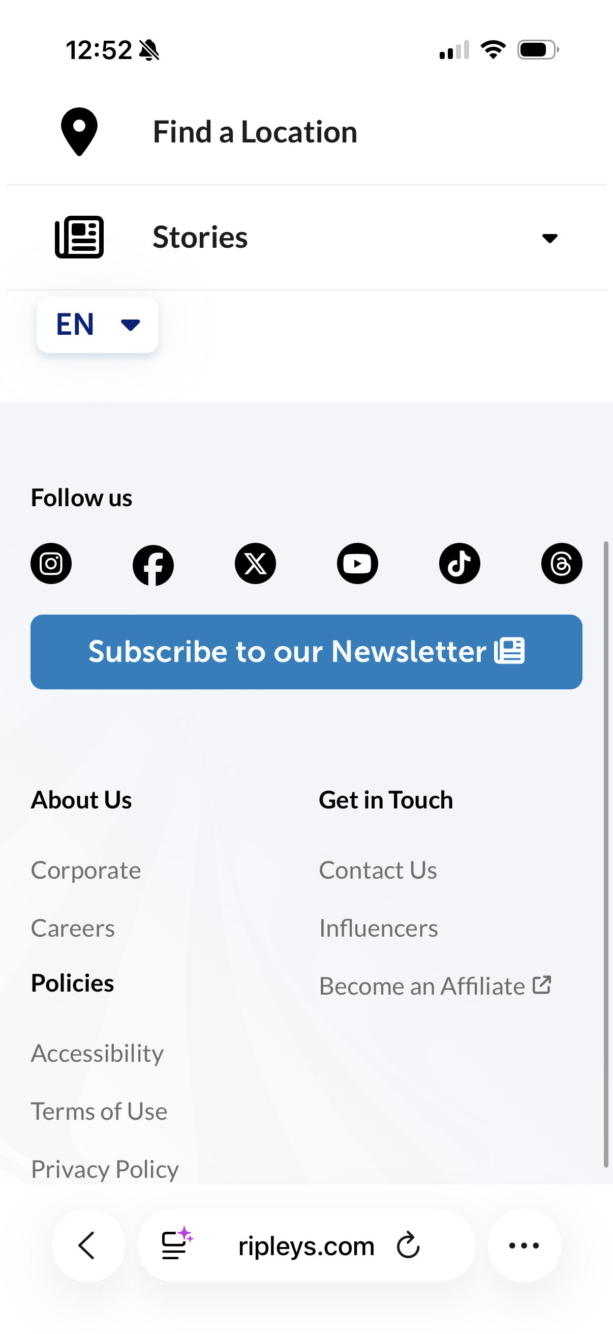
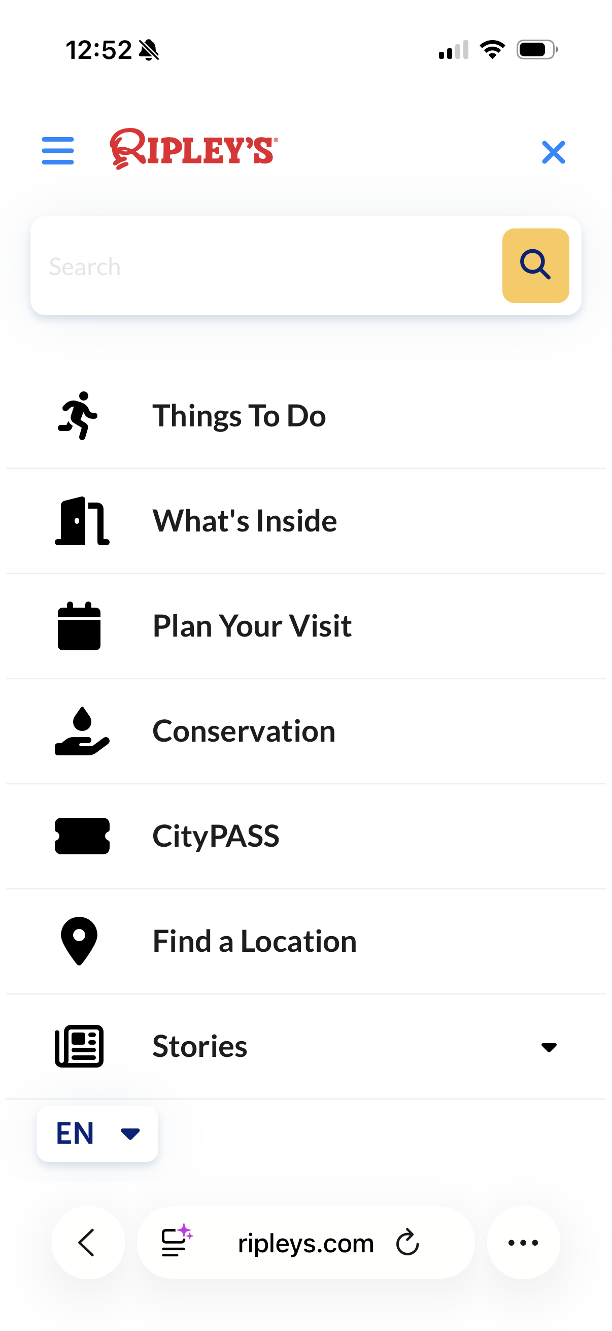
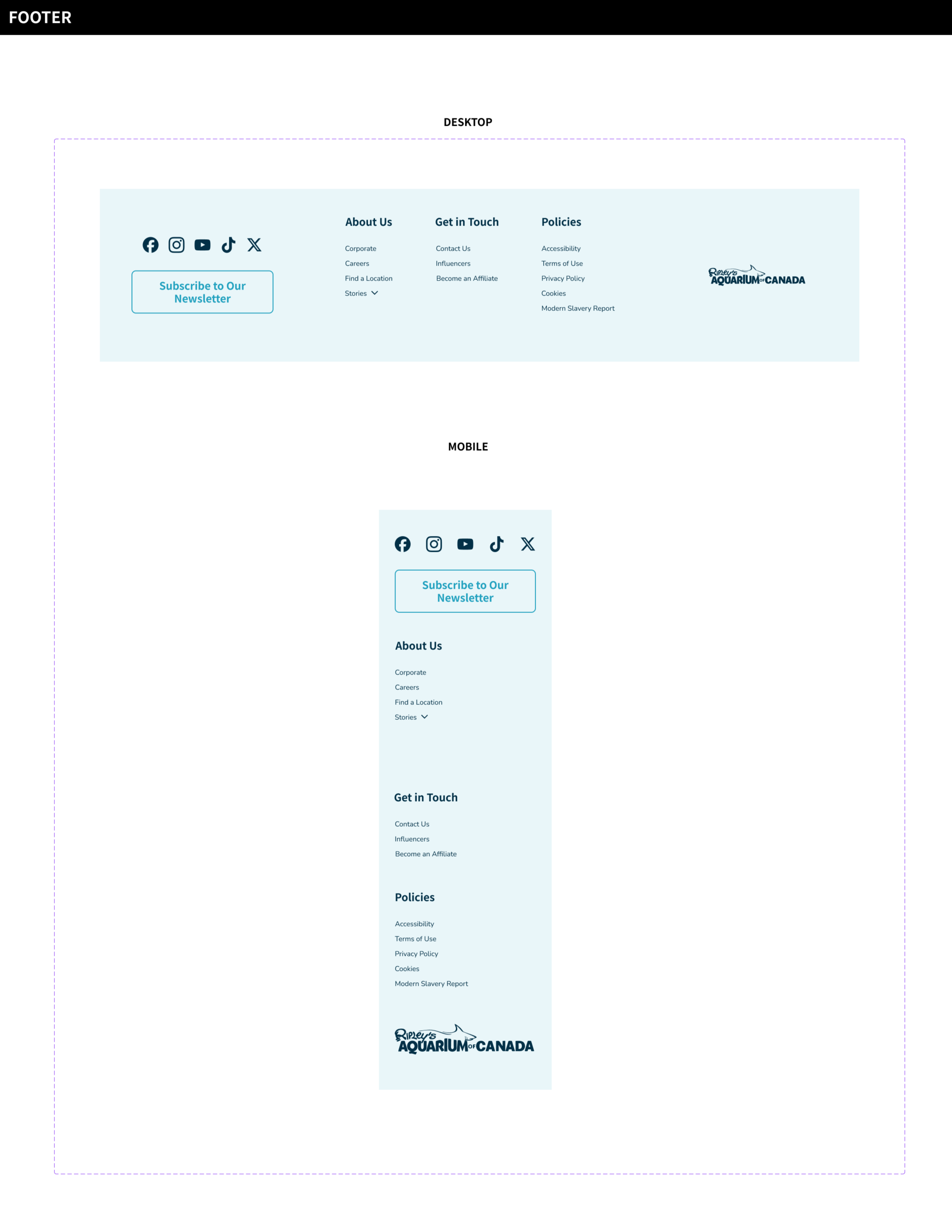
Fractured Device Parity: There was a significant lack of consistency between mobile and desktop devices. The absence of a standard footer on the desktop site created a broken user journey that did not align with mobile expectations.
Lack of Intentionality: The inconsistent application of color and layout suggested a lack of strategic oversight. If the digital interface fails to provide a seamless experience, it undermines the premium quality of the physical aquarium.
-
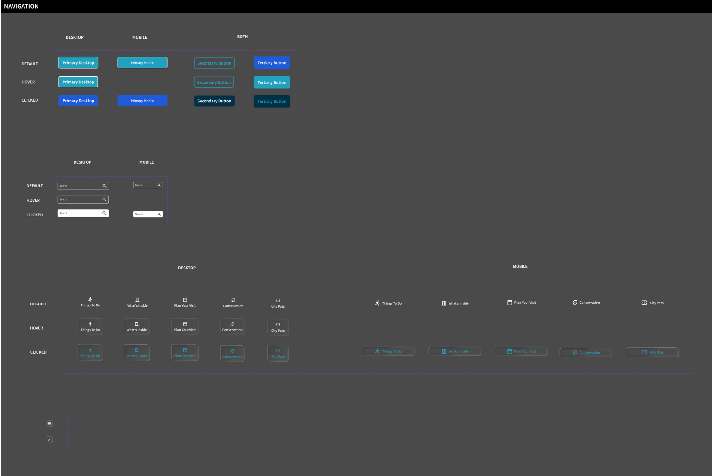
Conducted a visual audit of the legacy navigation and identified that too many elements were competing for the focus of the user.
Implemented a quiet design system that uses intentional whitespace and consistent typography to reduce cognitive load and guide the eye toward key actions.
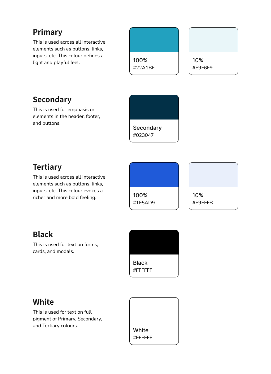
Curated a constrained color palette to ensure that the "Buy Tickets" call to action is the undisputed focal point. I believe that if every element is bright, then no element is important.
Established four strategic pillars for the redesign which are conversion driven navigation, inclusive accessibility, operational efficiency, and premium brand storytelling.
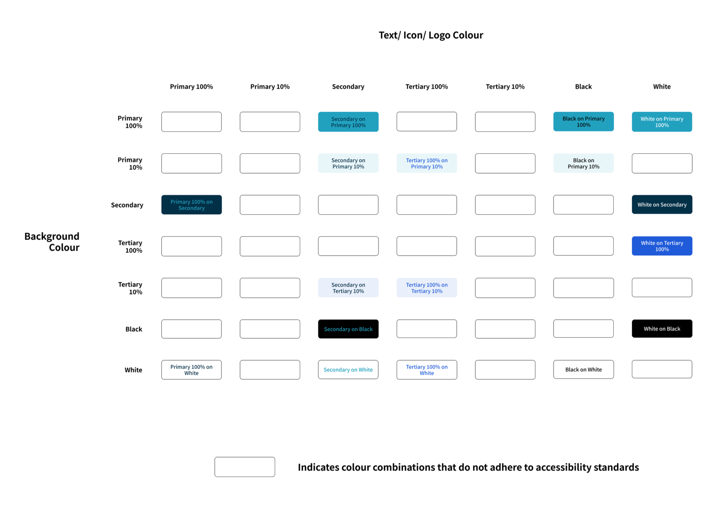
Developed an accessibility matrix to verify that all color pairings meet contrast standards. This ensures that the site is usable for a wider market and remains legally compliant.
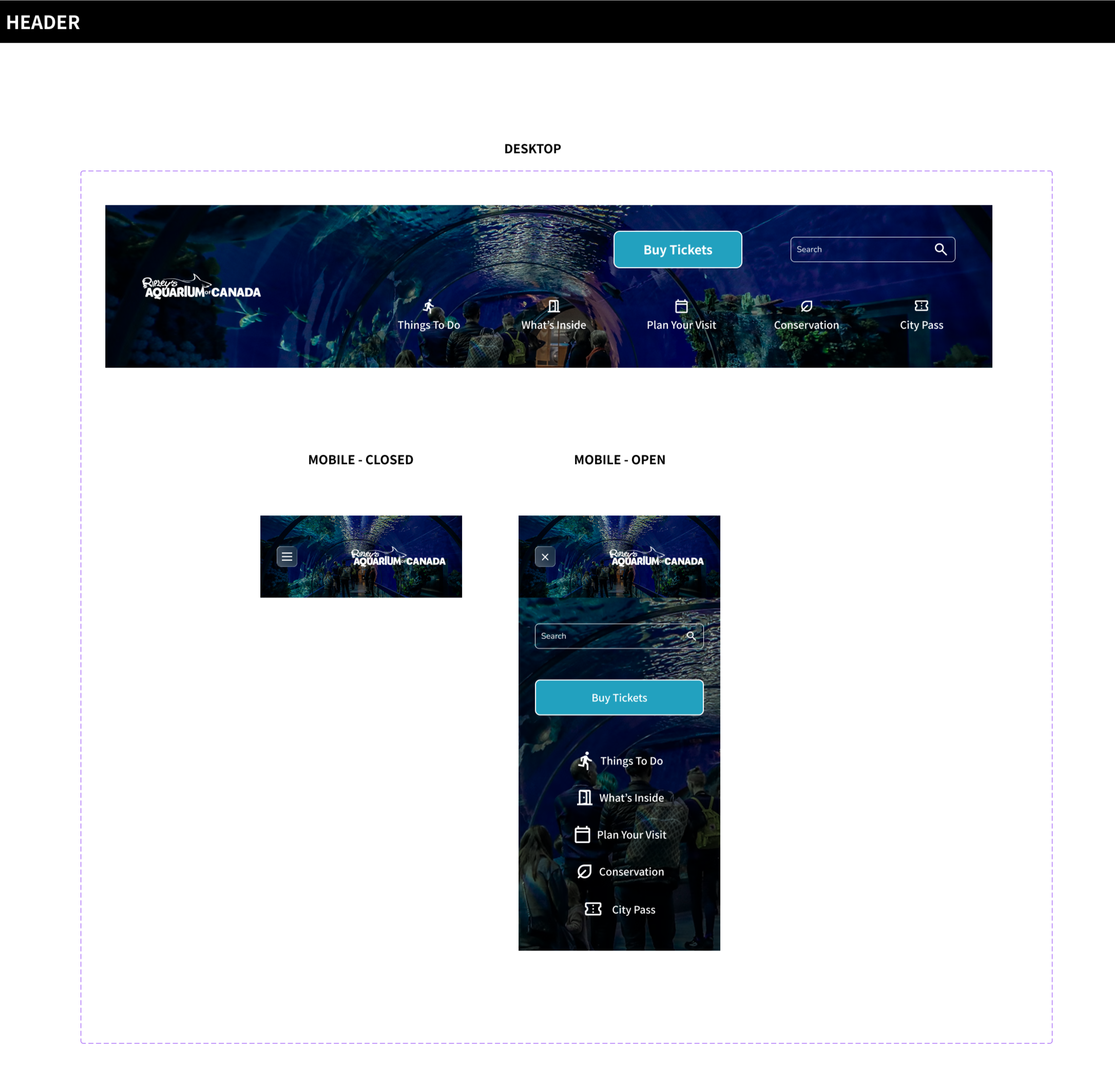
Created a responsive behavior map for global components like the header and footer. This documentation shows exactly how elements transition between desktop and mobile breakpoints to eliminate guesswork during the developer handoff.
-
Consistency is a form of trust. When things look and act the same way across the whole site, the user feels safe. If your navigation feels "immersive" on one page but standard on the next, you are creating tiny moments of anxiety. You need to be obsessed with predictability.
Systems are about scale, not just components. You listed buttons and cards. That is a kit, not a system. A real lesson here is that a system must account for how those elements grow or shrink when the marketing team decides to run a fifty percent off sale and the text suddenly doubles in length.
-
Conduct Contextual Field Research: I should observe customers as they purchase tickets in real-world settings. Uncovering friction points like environmental glare or time constraints is essential for building a truly resilient navigation system.
Accelerated Iteration: I would leverage AI to rapidly scale visual exploration, then apply my own critical judgment to refine the strongest concepts, and utilize empirical A/B testing to validate performance and ensure high conversion rates.
The Company
Ripley’s Aquarium of Canada is a premier attraction in Toronto. It serves as a major destination for local families, international tourists, and educational school groups. The aquarium operates on a model that demands high-volume ticket sales and efficient queue management. The digital platform is the primary place where visitors view ticket availability and complete the reservation process.
The digital experience has a direct impact on the bottom line. Most customers arrive at the site with a specific intent. They want to buy a ticket for a specific time slot, and they often do this while they are on the move. The site also acts as a critical touchpoint that builds trust before the visitor ever arrives at the doors. Any friction results in lost revenue.
The Problem Surfaced In Plain Sight
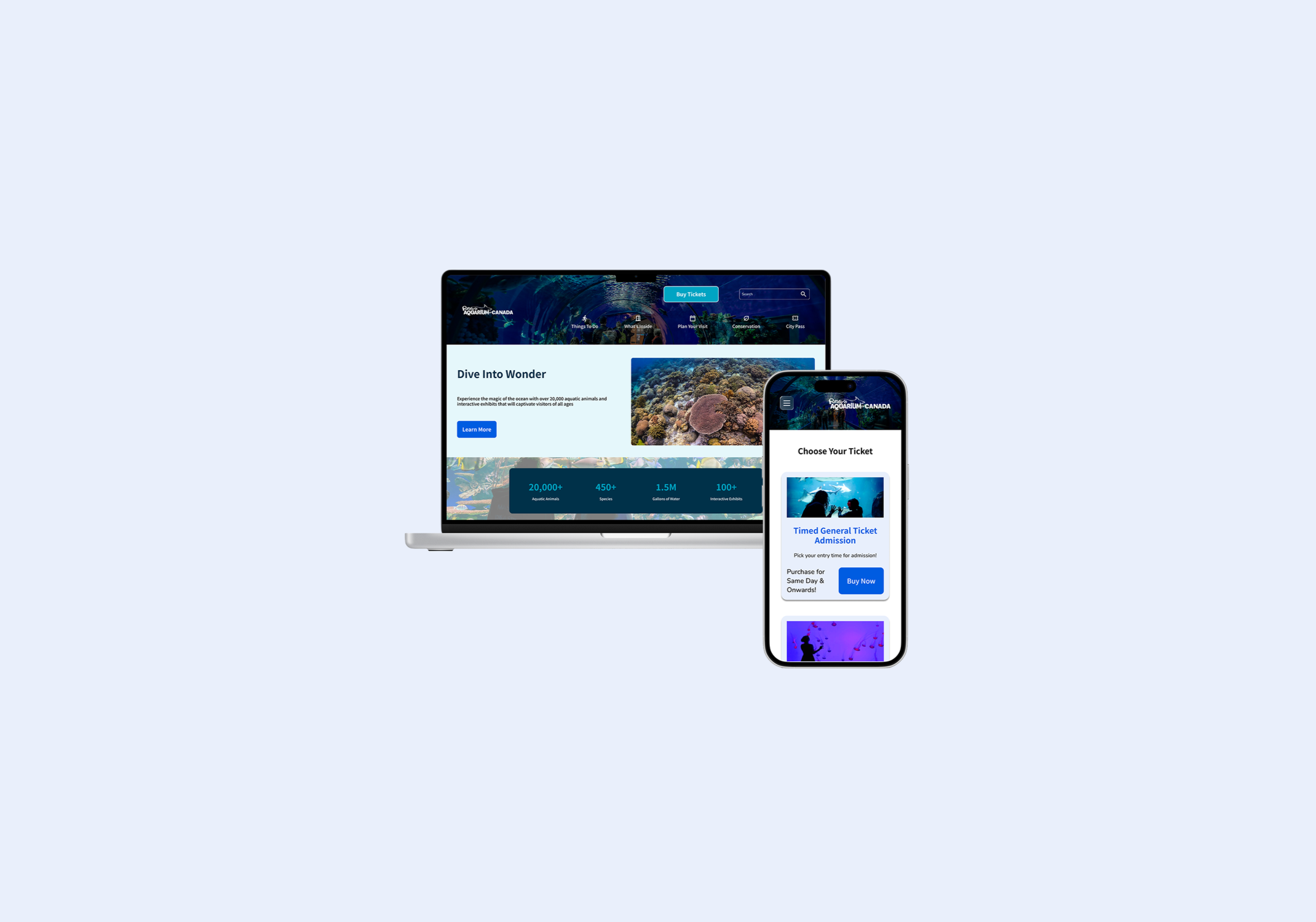
The existing digital presence for Ripley’s Aquarium felt like a collection of disjointed experiences rather than a single, unified platform. The navigation was overwhelmed with competing elements that forced users to expend excessive mental energy just to find basic information. Furthermore, the experience was not uniform across devices. The desktop site lacked essential structural elements, such as a consistent footer, which forced a broken journey compared to the mobile version. When a digital interface lacks cohesion, it naturally erodes the trust that a visitor should have in a world class attraction. My goal was to move away from this fragmented approach and build a system where every interaction feels intentional.
The Audit & Process
My design process began with a walk through the legacy site. It was immediately clear that every single pixel was fighting for the attention of the user. It felt loud and disjointed. I realized that when every element screams for attention, the user effectively hears nothing. I decided to strip everything back to the basics because a design that tries to say everything at once is a design that fails to communicate.
My response was to build a quiet system. I leaned heavily into whitespace and consistent typography to create a sense of calm. This allowed the content to breathe. I limited the color palette so that the "Buy Tickets" button would not just sit on the page, but stand out as the singular, undisputed destination for the user. If every element is bright, then nothing is truly important
I also included supplementary information in my design system to help a designer quickly understand colour pairings and desktop to mobile header and footer transitions.
Accessibility Matrix: I developed supplementary documentation to streamline the design process and facilitate a smoother developer handoff. A central part of this is a color contrast matrix. This chart provides an immediate reference for which foreground and background combinations meet accessibility standards. It eliminates any guesswork during the design phase.
Responsive Behaviour Mapping: I also included a responsive behavior map for the global headers and footers. This documentation shows exactly how elements shift and stack as the screen size changes across various breakpoints. By defining these transitions early, I reduced the potential for technical debt and ensured that the engineering team has a clear blueprint for implementation. It is about making the transition from a Figma file to a live product as seamless as possible.
The Result
The redesigned Ripley’s design system focuses on four pillars. By standardizing components and prioritizing the ticket sales funnel, the system reduces user friction and development costs. It transforms the website from a simple information hub into a high-performance business tool that justifies premium pricing through visual consistency and accessibility compliance.
1. Conversion-Focused Navigation
A website for an aquarium has one primary job. It must sell tickets and memberships. I implemented an icon and label pairing system to reduce cognitive load across all devices. This is vital for a parent who is likely distracted while trying to book a visit. By keeping the "Buy Tickets" button in a fixed, high-contrast location, I removed the need for the user to search for the next step. Thinking is the enemy of buying. A frictionless path to the checkout page is the most direct way to increase revenue.
2. Market Expansion through Accessibility
Accessibility is often treated like a chore or a legal requirement. I view it as a massive business opportunity. I tested all color pairings against WCAG contrast standards to ensure that the site is usable for everyone. This includes the millions of people with visual impairments or motor issues. If a potential customer cannot navigate the site with a screen reader, they will take their money to a competitor. This design system ensures that we do not leave that segment of the market behind.
3. Operational Efficiency and Scalability
Designers and developers should not have to reinvent the wheel for every new shark exhibit or holiday event. I built a comprehensive library of components that covers buttons, forms, cards, and navigation. This system reduces the time to market for new promotional pages. In a fast-moving entertainment industry, moving from a three-week development cycle to a three-day cycle saves an immense amount of money on labor. It allows the team to focus on high-level strategy instead of pushing pixels.
4. Brand Trust and Storytelling
Consistency builds authority and justifies a premium price point. I used a constrained color palette to create a high-end feel that matches the physical prestige of the aquarium. I also included a "glass effect" on the navigation bars. This is not just a visual gimmick. It acts as a bridge between the digital interface and the physical reality of tapping on an aquarium tank. It creates a cohesive brand story that makes the visitor feel like their experience has already begun before they even walk through the front doors.