Mr. Sub
The Friction & Flaws We Uncovered
Overview
-
Mr Sub’s desktop site has multiple points of friction throughout four key user tasks:
1) Ordering individual food
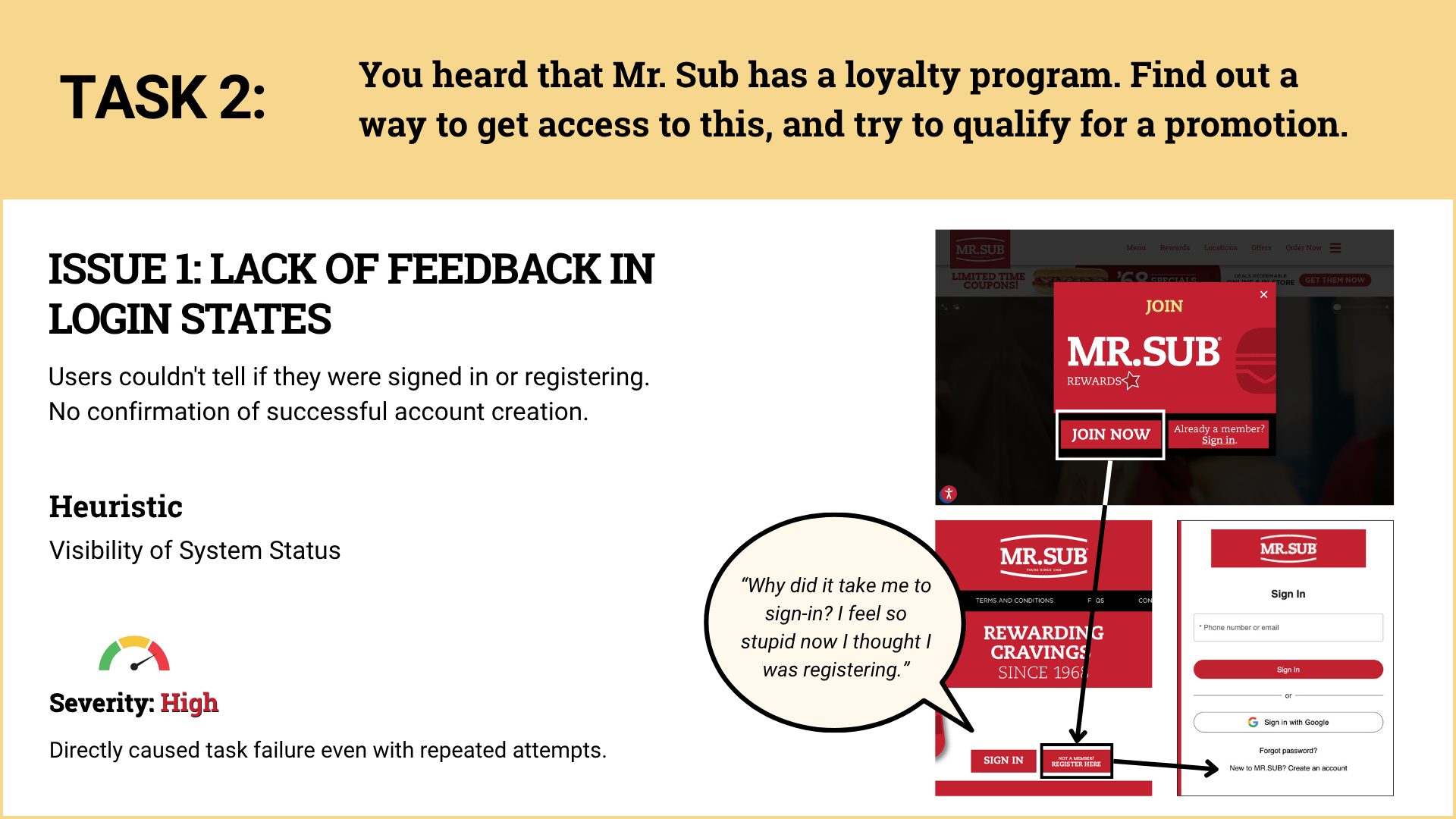
2) Finding the rewards system
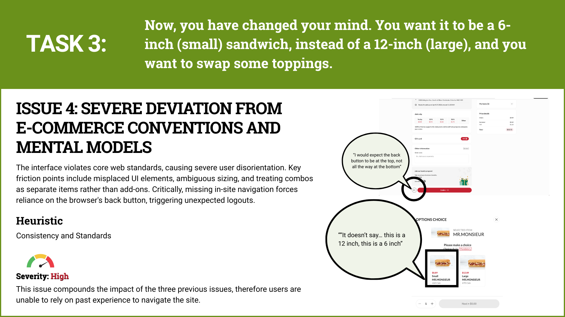
3) Changing an order in the cart
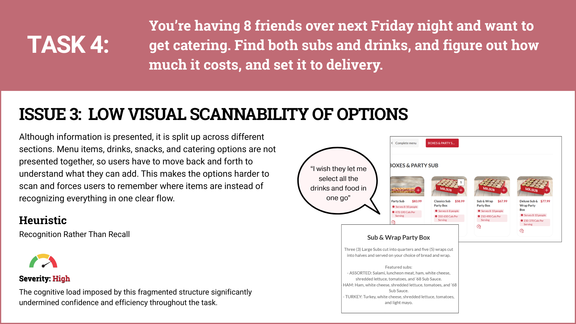
4) Ordering catering
This ultimately creates barriers to task completion, leading to lost revenue and poor brand image for the business.
-
My team and I performed a usability evaluation of Mr. Sub’s website, with a focus on the core ordering, account, and customization flows
My Role - UX Researcher:
Performed an expert review against established usability principles (heuristics) to identify potential issues and ensure best practices
Observed 2/8 recruited users performing the planned tasks, recording their interactions and gathering valuable qualitative and quantitative feedback
Compiled and analyzed all collected data to identify user behaviour patterns, recurrent usability problems, and performance bottlenecks
Consolidated findings and presented actionable recommendations for prioritizing user interface improvements and enhancing the overall experience
-
Heuristics Provide the Map: Using a formal heuristic evaluation allowed me to categorize random gripes into a structured plan for improvement. It turned subjective opinions into a objective list of violations that we could actually fix to improve the success rate of the site
Consistency is a Trust Signal: When a logo does not lead back to the home page or a back button disappears, users start to feel uneasy. I learned that following established e-commerce patterns is not just about being "standard." It is about making the user feel safe and in control of their own journey.
-
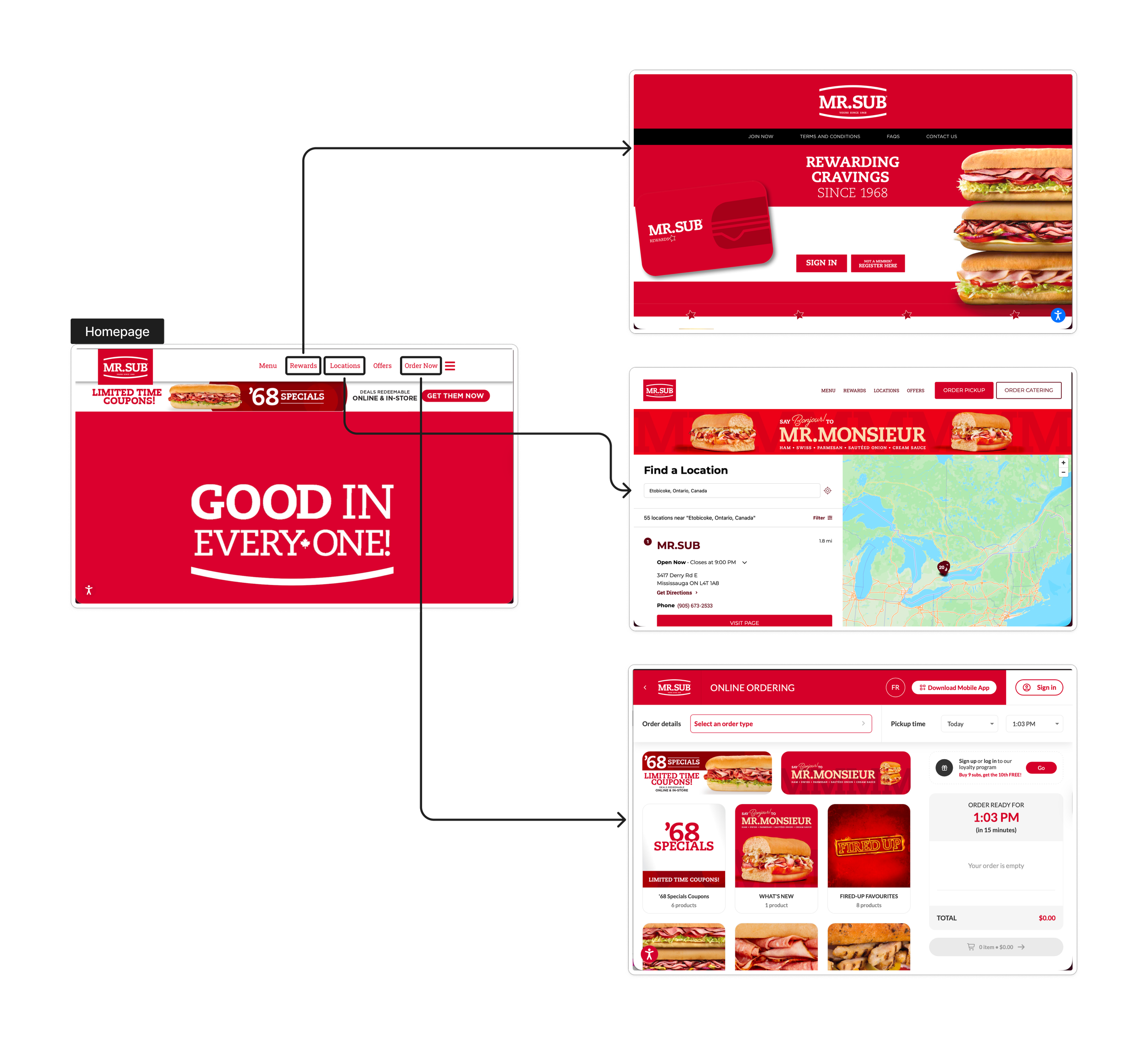
Create one clear ordering path for everyday orders and catering orders, with a clear CTA on the homepage. This will also input delivery and address details only once, creating efficiency.
Present information in a more easily-digestible manner with a larger variety and breadth of images, so users are not guessing product details and can confidently add the product to cart.
Ensure the logo always navigates back to the homepage, and interactive elements are clearly distinguishable from static ones (e.g. hover states, underlines, arrow indicastors).
Remove value-reducing elements such as the pop-ups at the beginning of the journey, and prioritize task-focused actions like browsing and ordering first. Delay rewards or account prompts until after checkout or at more relevant moments.
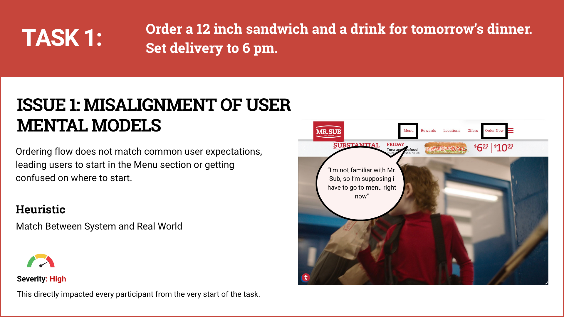
Mr. Sub Makes It Feel Like They’re Gatekeeping Sandwiches
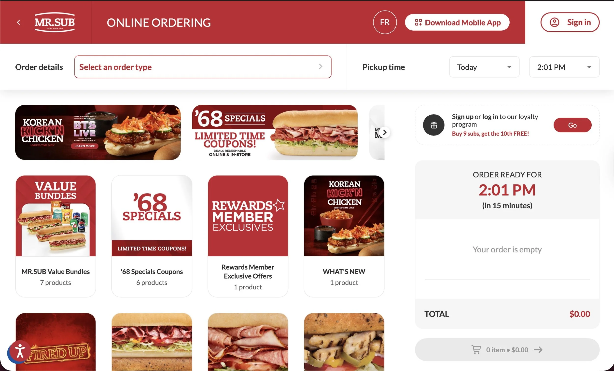
Mr. Sub has been a Canadian staple since 1968, built on the value proposition of fresh, custom subs made your way. However, the digital experience currently acts as a gatekeeper rather than a facilitator. For example, the business logic requires users to commit to a location and delivery time before they can even see the price of a sandwich. Although this may be a backend system constraint, this creates a high barrier for casual browsers who just want to see what is for dinner before providing personal data.
Bridging The Gap Between Function & Friction
The Mr. Sub’s website is a bit of a contradiction. While participants in our study successfully navigated the core tasks, the journey was far from delightful. Most users managed to reach the finish line, but they did so while navigating a maze of confusing pop-ups, rigid customization tools, and broken navigation loops. It is functional enough to work, but frustrating enough to make someone consider closing the tab and ordering from Uber Eats instead.
Upon first glance, the lack of visual continuity across the ordering funnel erodes user confidence.
How The Data Exposed Negative Themes
This project evaluated the Mr. Sub website to identify why users were feeling frustrated despite successfully finishing their orders. Along with my team members, we led a moderated remote usability study with eight participants to observe how they handled everything from group catering to loyalty program enrollment. We found a significant gap between the functional success of the site and the emotional satisfaction of the people using it.
After we found out the truth, we put the site through a rigorous Heuristic Evaluation against established industry standards. We looked at the competition and realized that most modern food apps allow a "Menu First" approach. Our journey focused on identifying where the "Seamless Flow" broke down, such as when the site redirects users to external pages for checkout, stripping away their ability to navigate back to the cart. We used Affinity Mapping to cluster these "broken moments" into high-severity issues like redundant data entry and unhelpful error messages.
How Mr. Sub Can Improve
Overall, the Mr. Sub site allowed users to complete the main tasks, but the experience was not always smooth. Users were able to order catering, order individual food, change an order in the cart, and find the rewards system, but each flow created some friction. Improving navigation, cart editing, saved delivery information, and product images would make the site easier to maneuver and give users more confidence when placing an order.
Mr Sub. needs to optimize their website’s user experience so that new and regular customers will purchase from the site, and are motivated to remain loyal to the brand as their preferred sandwich shop.