Libby
Libby is losing users and risking revenue because of poor navigation and confusing jargon.
As the Information Architect, I audited the application, performed a competitive analysis, and ran three rounds of tree testing to remove friction. The result is a streamlined, high-fidelity prototype that keeps users engaged, instead of a broken flow that pushes them away.
How This Digital Library Works
Libby is a free digital service that lets people access content from their local public libraries. The app earns revenue through library licensing contracts, and those contracts get renewed based on circulation data. Every abandoned borrow or failed return represents a lost circulation event.
Therefore, a single lost event can threaten an entire contract renewal.
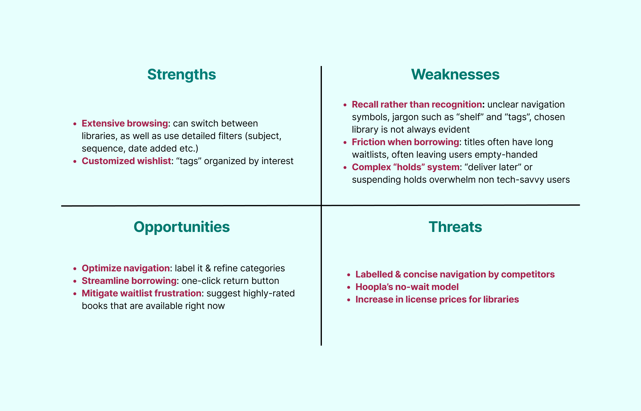
Unfortunately, Users Are Navigating A Black Hole
The primary issues are poor navigation and misaligned mental models.
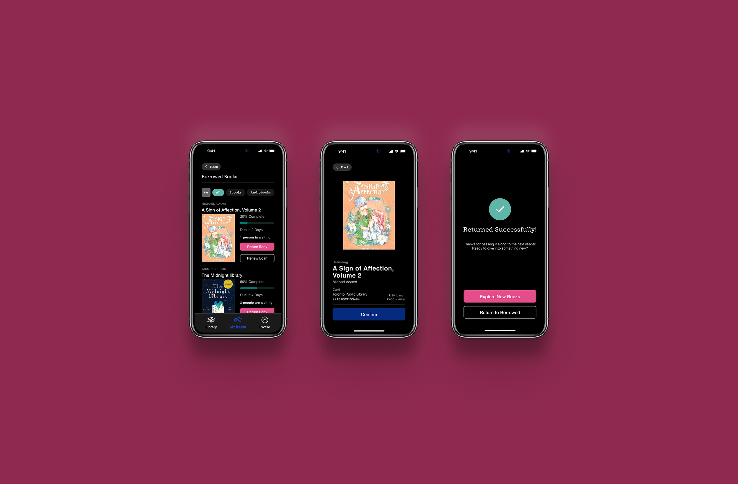
Users often feel scattered when they try to complete basic tasks, like returning a borrowed book early.
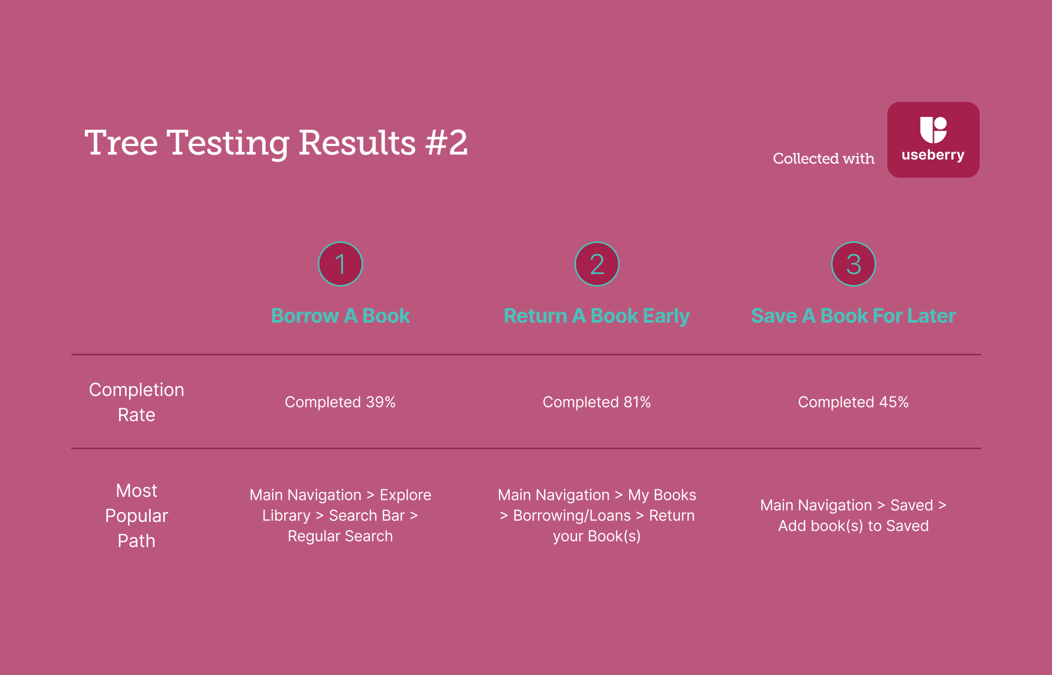
Terms such as "Manage Loan" are not clear enough, and that ambiguity leads to poor discoverability of critical actions.
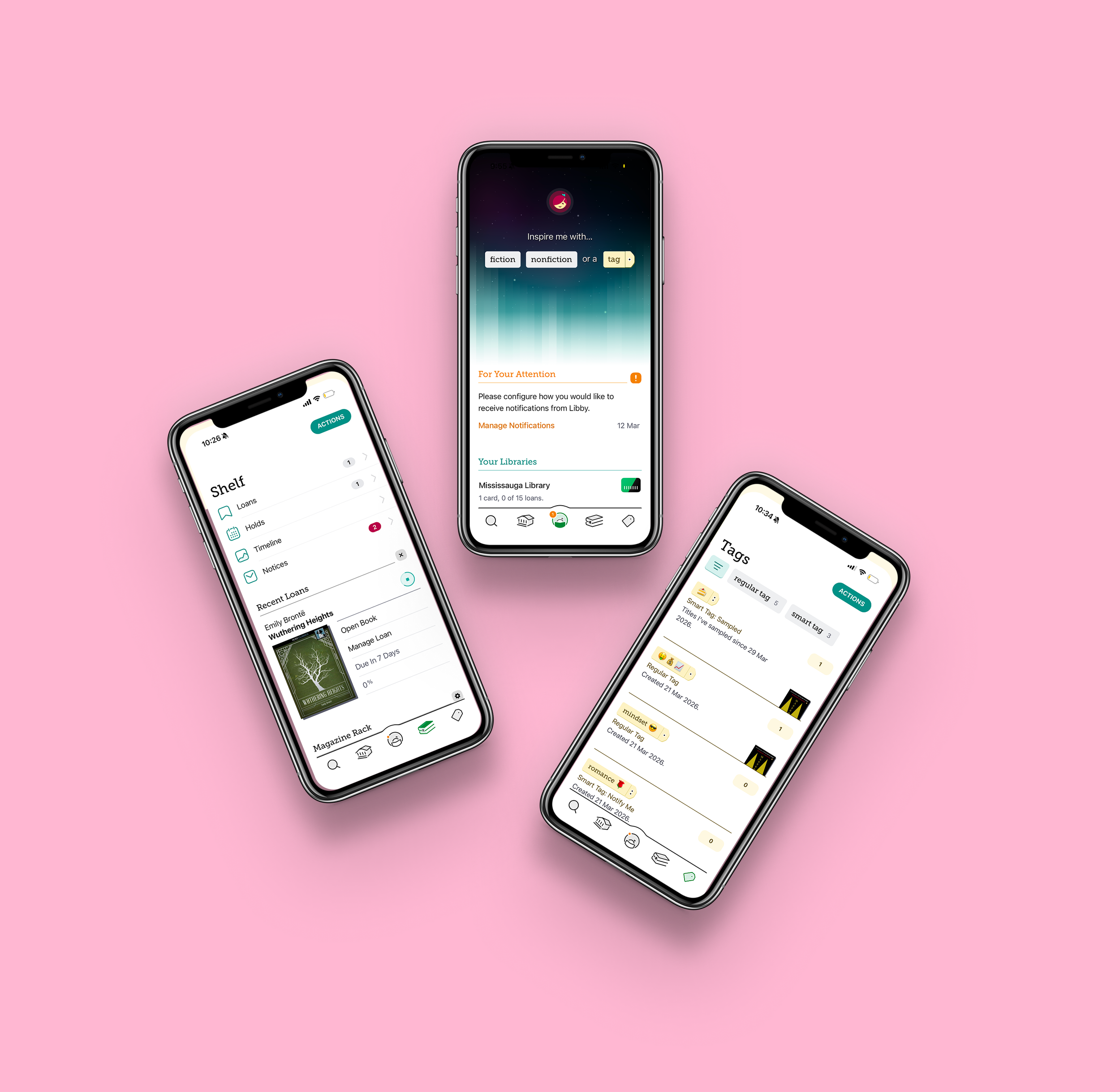
Many users do not understand the “Tags” purpose, or how tags differ from a standard wishlist.
How I Created a Seamless Flow
I collaborated with my team members to rethink how the application organizes its information
We wanted to decrease cognitive load and provide more clarity, so that users stay on the Libby app.
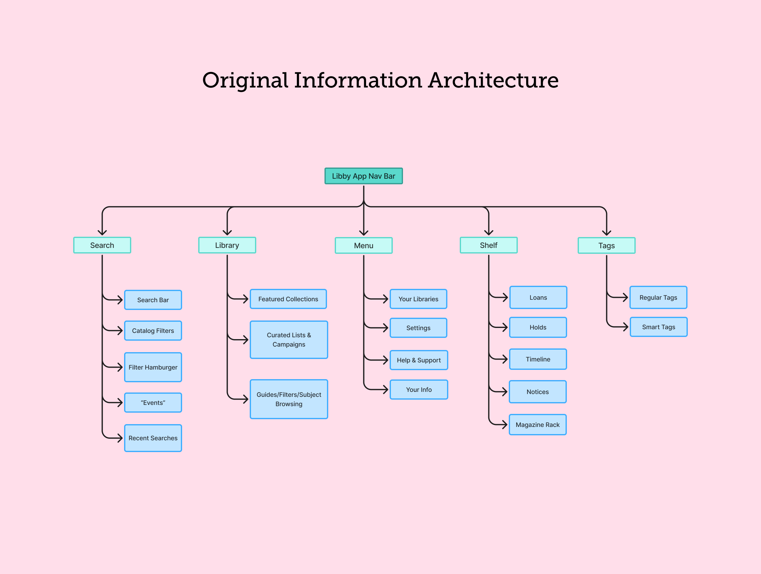
My team and I first defined the current information architecture, so that we could have a baseline understanding of the site’s navigation.
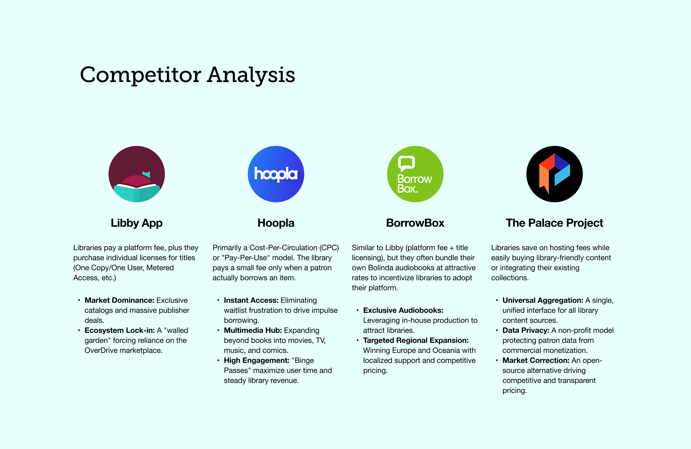
I began my part of the work by preparing a competitive analysis. I found that competitors like Hoopla and the Palace Project did several things better (e.g. clearer navigation bars and visible calls to action that helped users complete tasks throughout the app). This reminds me of walking into a well organized library versus one where the shelves have no labels. Users are able to find what they need quicker.
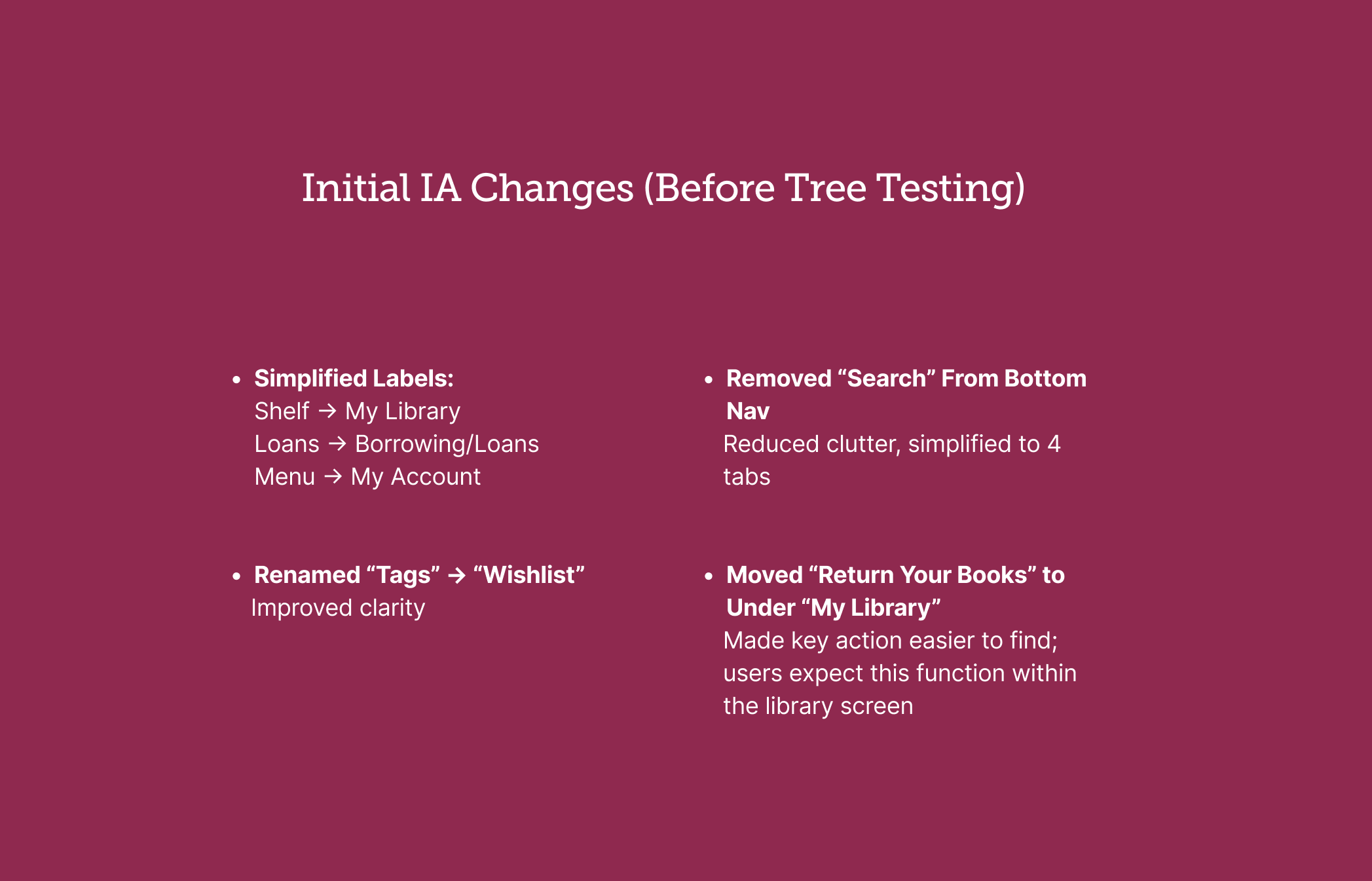
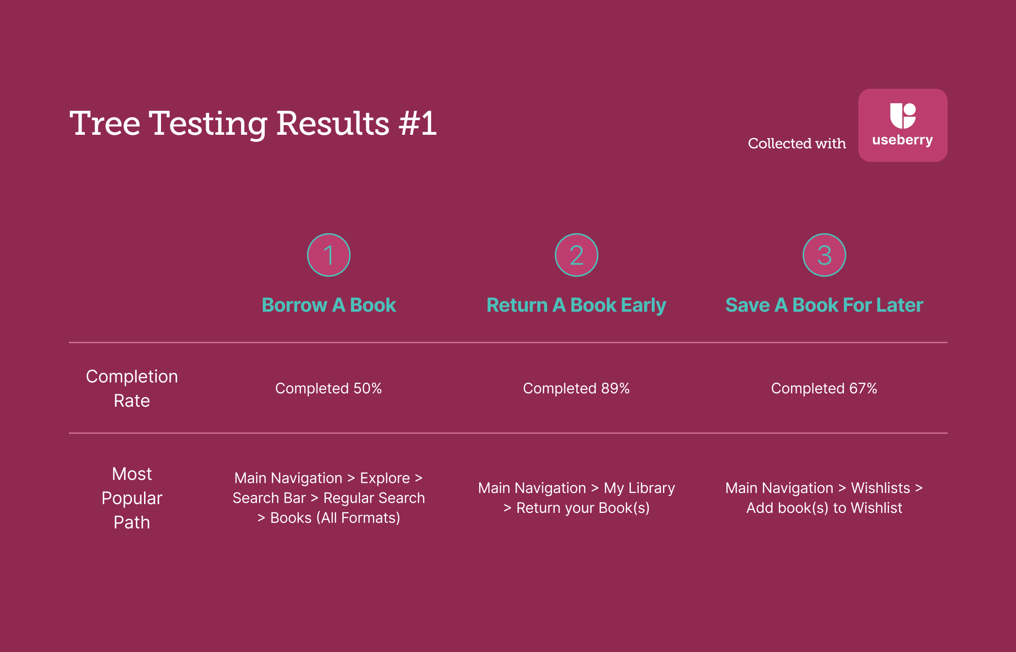
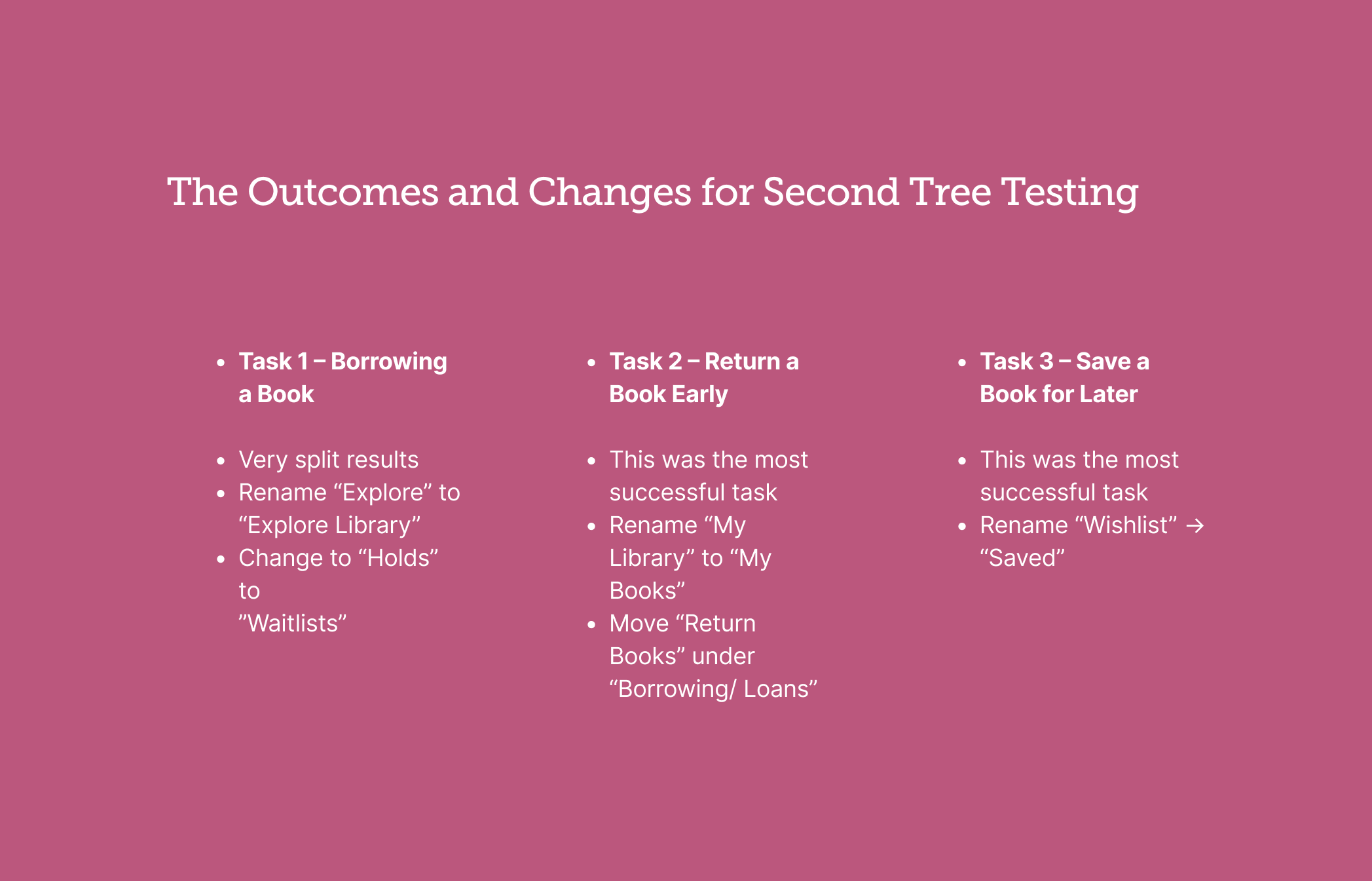
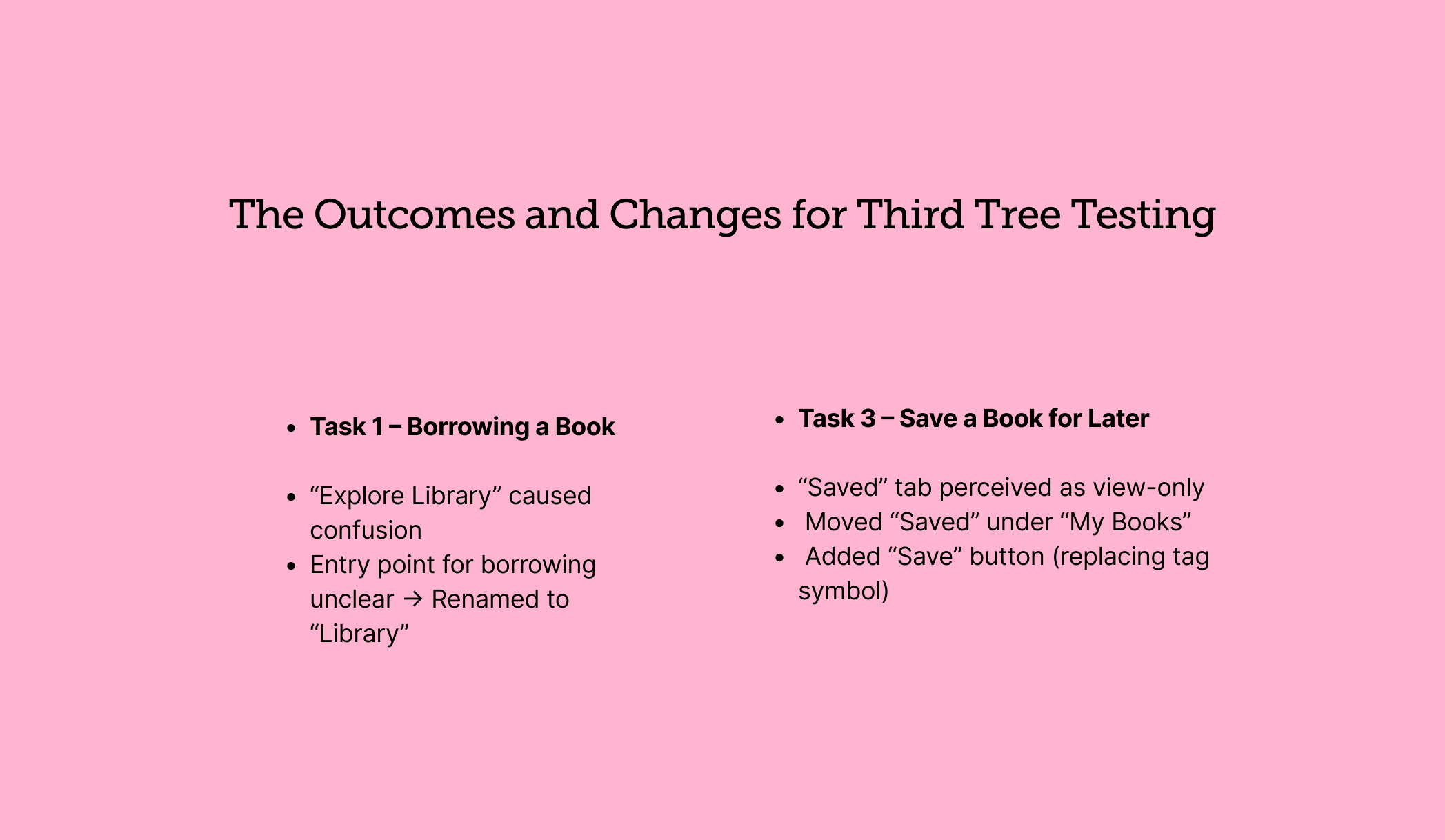
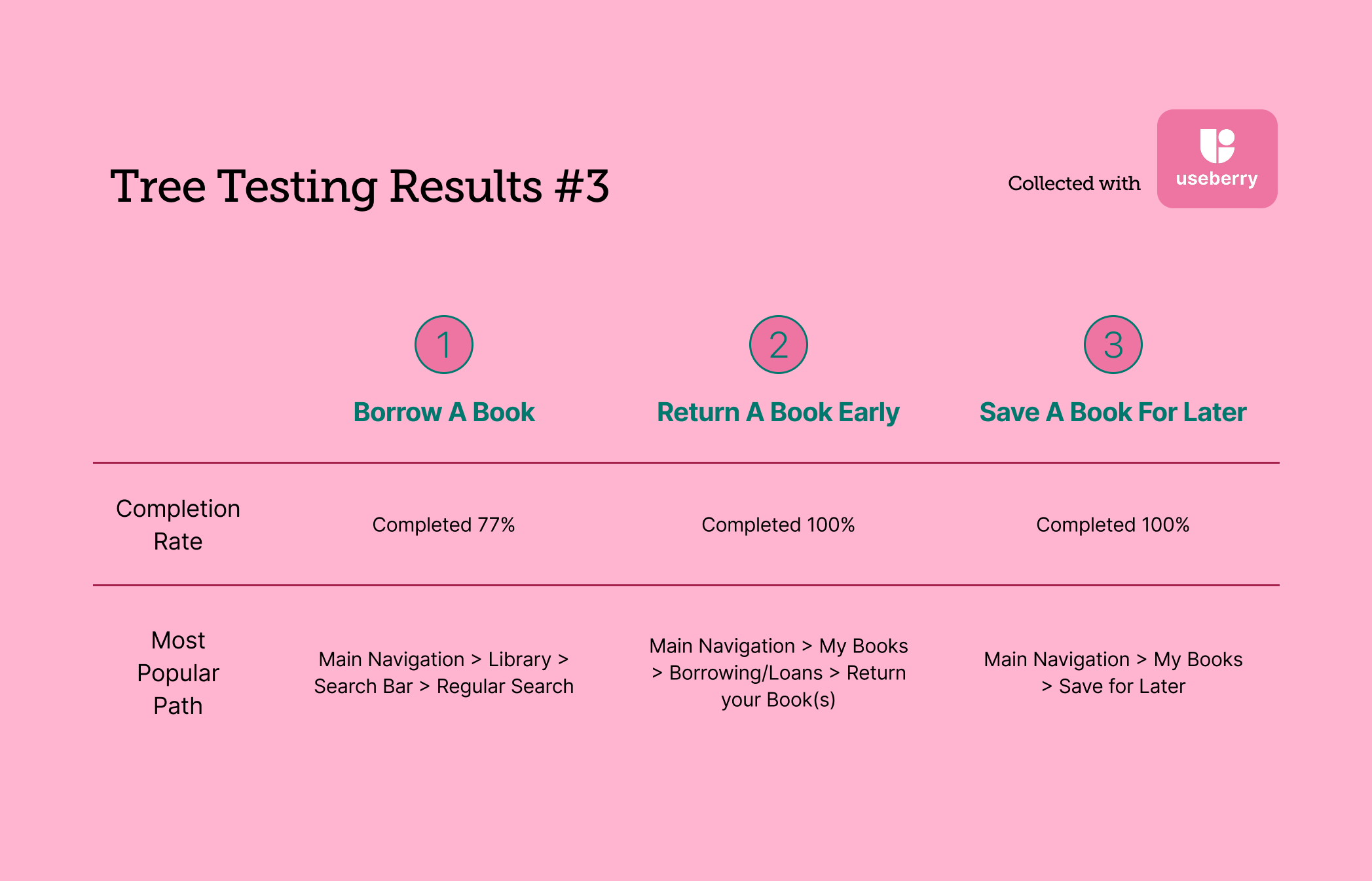
After three rounds of tree testing, my group and I had enough data to make real improvements for the final prototypes. We were not fundamentally changing the design of the app. Instead, we were making small, deliberate tweaks to improve overall navigation and usability.
Finally, An App Designed With the Reader In Mind
These targeted improvements address the core usability issues identified during user research and aim to create a more intuitive, confidence-building experience for all library patrons.
Goal 1) Standardize Navigation: Reduced the navigation bar from five ambiguous symbols to three clear sections that use both icons and text labels. This creates a more predictable and accessible framework.
Goal 2) Improve the Return Experience: Replaced the vague "Manage Loan" terminology with a direct "Return Early" button. The new “Borrowed Books” section gives users a clear overview of their current holdings, which makes the act of returning materials feel final and successful.
Goal 3) Improve the Borrowing Experience: Introduced a “Continue Reading” section and a personalized discovery module to increase circulation and reduce frustration with browsing the massive catalog. We also replaced confusing “Tags” jargon with a more intuitive "Saved Books".
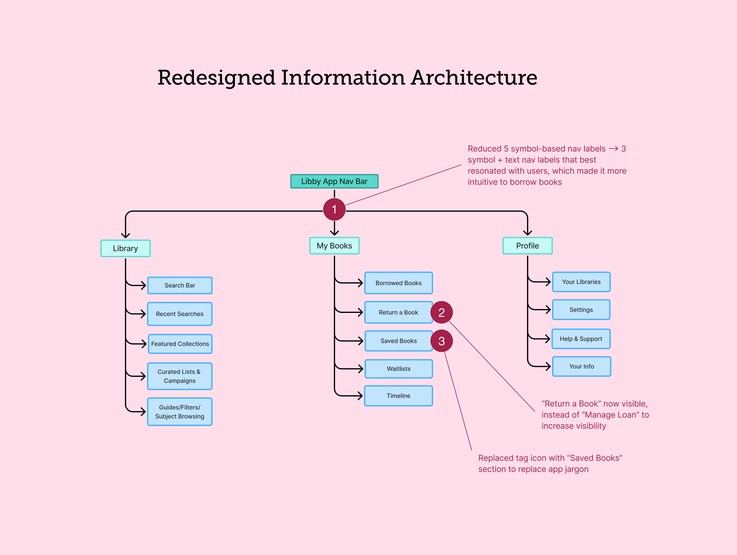
Lastly, we created prototypes to visualize these changes. We kept the original visual identity to best highlight the new information architecture.