Booster Juice
High cognitive load during key shopping moments was actively preventing conversions.
When finding a store location or purchasing a product requires heavy mental effort, the digital experience fails the user and risks losing them to a competitor. I utilized LATCH principles to design an enhanced utility bar and a high-fidelity prototype that prioritizes quick user action over site clutter.
About the Canadian Giant
Founded in 1999 in Sherwood Park, Alberta, Booster Juice was a pioneer that effectively introduced the smoothie and juice bar concept to the Canadian market. Over 25 years, they have achieved market dominance, scaling to over 450 locations across every province and territory. They currently hold a Canadian franchise record for opening 50 stores in their first two years, which is a testament to their aggressive growth and operational efficiency.
The brand operates as a "healthy" alternative to traditional quick-service restaurant chains. Their business model is built on:
Speed: Engineering physical stores for rapid throughput to serve customers on the move.
Health: Positioning "superfoods" (matcha, açaí, wheatgrass) as accessible, daily fuel.
Energy: Targeting an active, high-intent demographic, specifically Gen Z and Millennials who prioritize convenience without compromising nutrition.
Uh Oh... We Have a Digital Bottleneck
While Booster Juice dominates the physical landscape with award-winning store designs and a "Fit & Fun" atmosphere, their digital touchpoints lag behind. For a company targeting a tech-native audience that values speed above all else, a disorganized website acts as a digital "bottleneck".
While auditing the Booster Juice website, I identified numerous failures in the information architecture.
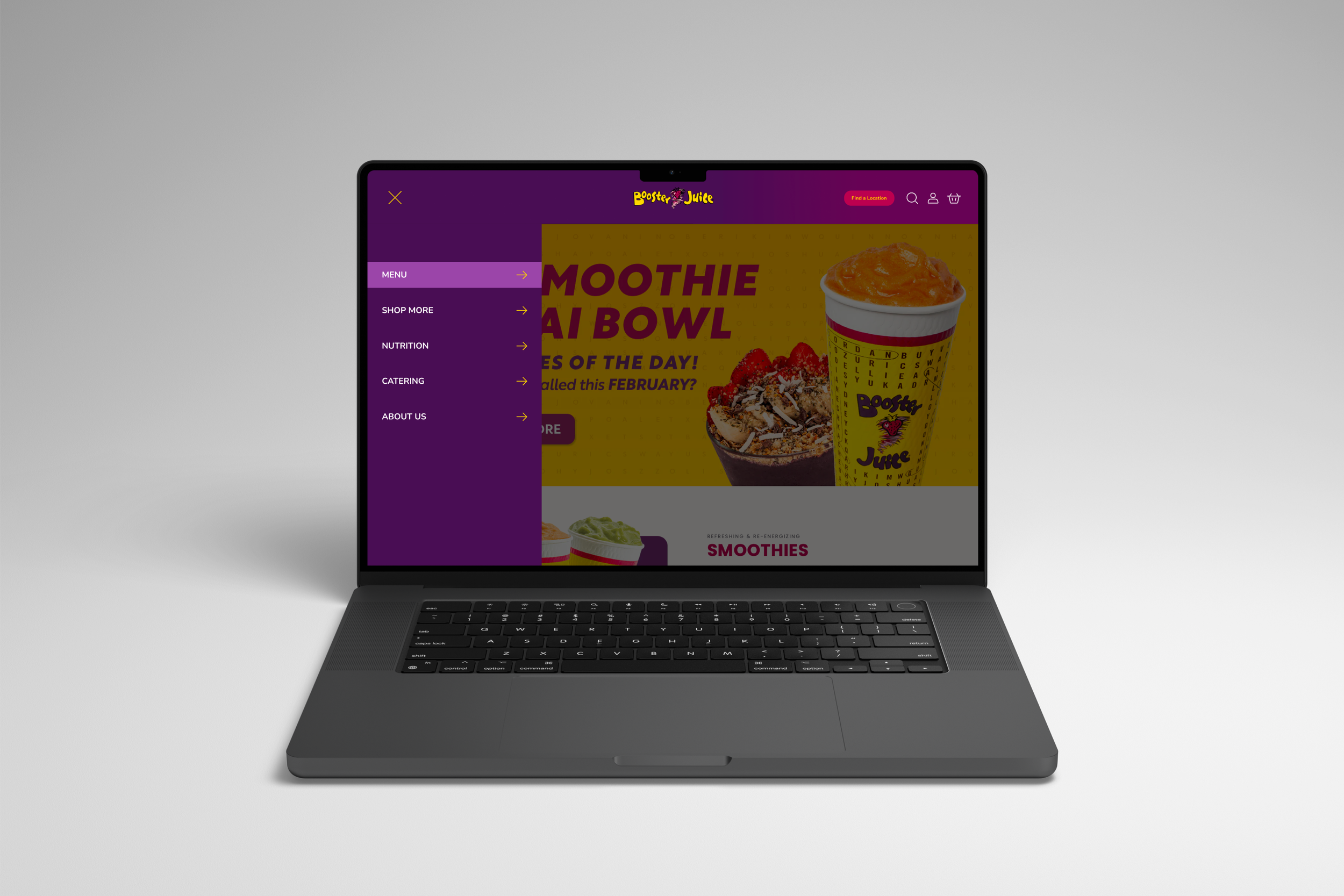
For the header, the current structure ignores the primary user goals of locating a store or purchasing products. By burying these high intent actions under a disorganized hierarchy, the site fails to utilize the LATCH principle of Category, resulting in a navigation menu that feels like a random list rather than a guided path. Additionally, twelve items in a primary mobile-style sidebar is too many. By failing to group related items (like "Careers," "Community," and "About Us") into a sub-menu, the site increases Hick’s Law — the more choices you give a user, the longer it takes for them to make a decision. By listing twelve items with equal visual weight, the site violates the principle that navigation should be a hierarchy. Without categories like "Our Menu" or "Company," the user is forced to perform a "linear scan." They have to read every single word from the top down to find what they need, which is a massive tax on their cognitive energy.
For the footer, under "Information," you have "FAQs" mixed with "Check Gift Card Balance" and "Non-Participating Locations." This is a classic violation of logical grouping. A user looking for help might not think to look under a generic "Information" header for a specific financial task like checking a balance. Additionally, the "About Us" section is bloated with ten different links. By giving "Our Story" and "Careers" the same visual weight as "Locations" and "Shop," the site fails to guide users toward high-value actions. It forces the user to scan a wall of text just to find a store.
This lack of prioritization across the website effectively halts the user journey at the exact moment they are ready to convert, meaning lost revenue for the company. I analyzed these navigational gaps to propose a restructured flow that aligns site logic with actual user mental models.
The Rebuild
Imagine landing on a Booster Juice site that actually matches the energy of the brand — effortless, vibrant, and lightning-fast. I set out to bridge the gap between their physical efficiency and their digital friction. By stripping away the clutter and rebuilding the foundation, I turned a confusing maze into a clear, high-velocity path to conversion.
I completely overhauled the information architecture to prioritize cognitive ease and logical hierarchy. This was not a guessing game; I ran five card-sorting sessions to map out how users actually think. The data led to a much needed separation of "Drink" and "Food" categories in the header, mirroring the mental models of a hungry customer. By moving actionable items (like Store Locators and Gift Cards) into the primary navigation and leaving only baseline information in the footer, I created a clear information hierarchy. This allows users to reach the bottom of the page and find exactly what they expect, such as legal and contact essentials, rather than getting lost in a maze of disorganized links.
To support high-intent users, I introduced an enhanced utility bar designed to fast-track the most critical goals: finding a location and shopping online. Once the research was solidified, I moved into Figma to build a high-fidelity prototype.
A Frictionless Path to Fresh Smoothies
The result is a digital experience that finally matches the "Fit & Fun" energy of the physical stores. By streamlining the navigation and prioritizing high-value actions, I transformed a disorganized maze into a guided path. Users no longer have to fight the interface to get a smoothie; they can now navigate from the homepage to a store location with zero cognitive friction.